
.png)
Creating A Travel App
My Role
UX Researcher
Designer
Overview:
Finding and booking travel can be stressful, with each site offering different prices and services. Our team was tasked with creating a product that improves the travel booking experience. We aimed to enhance travel accessibility for those who are unfamiliar with booking flights, renting cars, or finding hotels. Our goal was to simplify travel planning, making it less of a hassle and more enjoyable.
Approach:
We aimed to enhance the travel planning experience for users by initiating a comprehensive analysis to understand their needs for creating travel plans with ease. This involved developing a project plan that included user personas, user surveys, and comparative analysis. Our focus was on ideation, wireframing, and prototyping, using tools like Figma for design and user testing to refine and validate our solutions, ensuring the app effectively meets user needs and simplifies the travel planning process.

Step One: Understanding User Needs and Preferences
Research Goal:
Understand user needs and preferences for planning vacations and their interactions with travel apps.
Overview:
To create a user-centric travel planning app, we began by defining user personas that represented average travelers. We conducted surveys to gather insights into their needs and experiences with existing travel apps. This approach helped us connect with users, understand their preferences, and identify what they require to plan their vacations effectively.

User persona example.
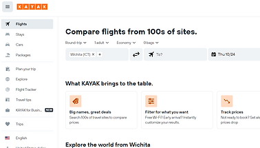
Screen Grab from KAYAK
Step Two: Comparative Analysis
Research Question:
How do existing travel planning platforms compare to one another, and what improvements can be made based on this comparison?
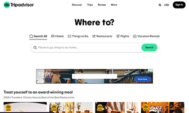
During the data collection phase, our team conducted a comparative analysis of various travel planning platforms, such as TripAdvisor and Kayak. We evaluated their features and functions to identify strengths and areas for improvement. After compiling a comparative analysis report, we used this information to develop scenarios for testing our ideas and designing a new travel app. This process helped us understand what works well in existing platforms and where enhancements could be made to better meet user needs.
Screen Grab from TripAdvisor
What we were looking for:
-
Understanding User Behavior: Insights into how users interact with travel apps.
-
User Preferences: Information on user preferences for features and functionality in travel planning apps.
-
Interaction Patterns: How users navigate and use different travel planning tools.
-
Areas for Improvement: Identifying issues or gaps in current travel apps and user needs for a more streamlined planning experience.
Findings:
-
Similarities:
-
Feature Options: All platforms provide extensive filtering options for stays, flights, cars, and packages, aiming to help users tailor their search.
-
User Experience: Each platform offers a clear and organized interface, with designated navigation elements to streamline user interaction.
-
-
Key Differences:
-
Expedia:
-
Website: Detailed filtering options and extensive information sources; however, promotional content is repetitive and not tailored to specific searches.
-
Mobile App: Organized interface with clear navigation; but cancellation process is non-intuitive, requiring steps outside the app.
-
-
Travelocity:
-
Website: Easy for first-time users with straightforward navigation and saved information; but design inconsistencies and an overwhelming help page.
-
Mobile App: User-friendly with smooth transitions and integrated features; but has issues with cruise tab redirection, random mode changes, and limited flight options.
-
-
Kayak:
-
Website: Extensive filters and useful travel tips; but lacks autofill and has non-functional navigation buttons.
-
Mobile App: Welcoming design with advanced features like flight tracking; but users may need to visit external sites to complete purchases, and a hidden game feature feels out of place.
-
-
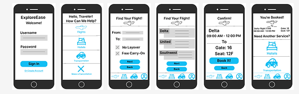
Step Three: Initial Sketches and User Validation
Overview:
After gathering user insights and defining personas, we proceeded to sketch initial wireframes for the travel app. We enlisted volunteers to review these sketches with their travel needs in mind, gathering valuable feedback on usability and design effectiveness. This feedback guided us in refining our early concepts. Subsequently, we developed a lo-fi wireframe using Figma to further iterate and enhance our design.

App sketches

Website Sketches
Problem Identification:
The problem we identified is that the existing travel planning platforms often overwhelm users with disparate information, making the process stressful and inefficient. Users struggle to find relevant and affordable options for flights, accommodations, and car rentals due to scattered and inconsistent information.
Hypothesis: The current travel planning apps do not effectively consolidate user needs and preferences, resulting in a fragmented and stressful booking experience.
-
How might we streamline travel information to make it more accessible and user-friendly?
-
How can we integrate flight, accommodation, and car rental options into a single platform that simplifies the booking process?
-
How might we enhance the usability of the app for users who are unfamiliar with travel planning or booking tools?
-
How can we ensure that the app provides clear, relevant, and actionable information to improve the overall travel planning experience?
I believe that, by conducting user research, performing a comparative analysis of existing travel platforms, and implementing user feedback, we aimed to create a more cohesive and user-friendly travel app. This approach was designed to enhance the booking process, making it more efficient and enjoyable for users.
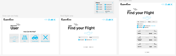
Step Four: Designing
We decided to involve the entire team in the design phase to gather a diverse set of opinions on the travel app’s wireframe. Each team member shared their perspective on what features and improvements were needed. This collaborative approach allowed us to refine the wireframe for both the app and the website effectively.
From our discussions, we identified key areas for improvement, such as ensuring that users easily notice and interact with the app. We incorporated feedback to enhance the app’s usability and visual appeal. For example, we implemented a prominent "touch to start" feature to make the app’s interactive elements more noticeable. Additionally, we refined the app’s branding to ensure consistency and alignment with user preferences. This collaborative process enabled us to develop a more user-centered and effective design.
Mockups for Travel App
Mockups for Travel Website
Step Five: Project Pitch
Overview:
After finalizing the wireframe for the travel app, we prepared to pitch our project to the class. I took the lead in designing a comprehensive slide deck to provide an overview of the app and its features. We created both a detailed presentation and a shorter summary version to cater to different aspects of the pitch. My team and I collaborated to ensure the information was presented cohesively and effectively, highlighting the key elements of our travel app.
Key Features and Design Considerations:
-
Wide Range of Filtering Options and Personalized Settings:
-
Allowing users to fully customize their travel planning experience with their future trip in mind
-
-
Tools for Enhanced User Assistance:
-
Allow tools for price alerts, featured tips, bag measurement, and a flight tracker to limit the apps needed for the users and enhance the user experience.
-
-
Improved Cancellation and Payment Processes:
-
Simplification and optimization of cancellation and payment processes to mitigate friction points and enhance user convenience.
-
-
Seamless Integration of Travel Components:
-
Consolidation of flights, hotels, and car rentals into a unified platform, offering users seamless access to their travel itinerary.
-
Rationale behind Design Choices:
-
Addressing User Pain Points:
-
We wanted to streamline the flight research process and consolidate travel-related information into a single, cohesive platform.
-
-
Enhancing User Experience:
-
By prioritizing ease of access and user friendly navigation, we aimed to empower users with tools and features that informed decision-making throughout the travel planning journey as well as after.
-
-
Seamless Integration:
-
Recognizing the importance of seamlessness in user interactions, we integrated previously purchased flights and accommodation details into the platform, allowing users to go back and see if they wanted to stay in the same place for a later trip.
-
What I learned:
One of the most impactful things I learned has been learning to navigate the dynamics of teamwork. I had the opportunity to assume a leadership role for this project, this experience not only broadened my perspective on effective project management but also prompted significant personal growth. I had not previously considered the possibility of taking on such a role, making this a particularly enlightening experience.
The landscape analysis was an enlightening exercise that provided me with a new understanding of my own research capabilities. This project allowed me to view digital content from a user-centric perspective, contributing significantly to my understanding of effective website organization. Which added to my overall focus on user experience as a whole.
Collaborative discussions with fellow group members allowed us to efficiently divide the workload, turning a potentially stressful situation into a more manageable one. Allowing me to put in perspective that communication in collaboration is an important part of any project. Personally, I found creating wireframes, including sketches and low-fi representations, to be a particularly enjoyable aspect of the project. Witnessing ideas come to life, even in their early stages, provided a tangible sense of accomplishment for me. I believe I have developed a comprehensive understanding of the processes behind creating an app and website.
The challenges encountered throughout this project have contributed significantly to my professional and personal growth. While I will refrain from claiming perfection, I acknowledge that the journey of learning is an ongoing process. As this project concludes, I am grateful for the valuable lessons learned and the growth experienced. I may also recognize that this project could have been improved on, as all projects are never 100% perfect, but I can confidently affirm that this project has been a fulfilling journey of learning and development.